

滚动加载更多内容

Free AI Prompt Library for Designers
Copy ready-to-use AI prompts for posters, photography, ecommerce, illustration, packaging, typography, and icons.
Log in to upload and share your AI artworks
Popular Prompts
Click to copy and use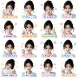
Poster
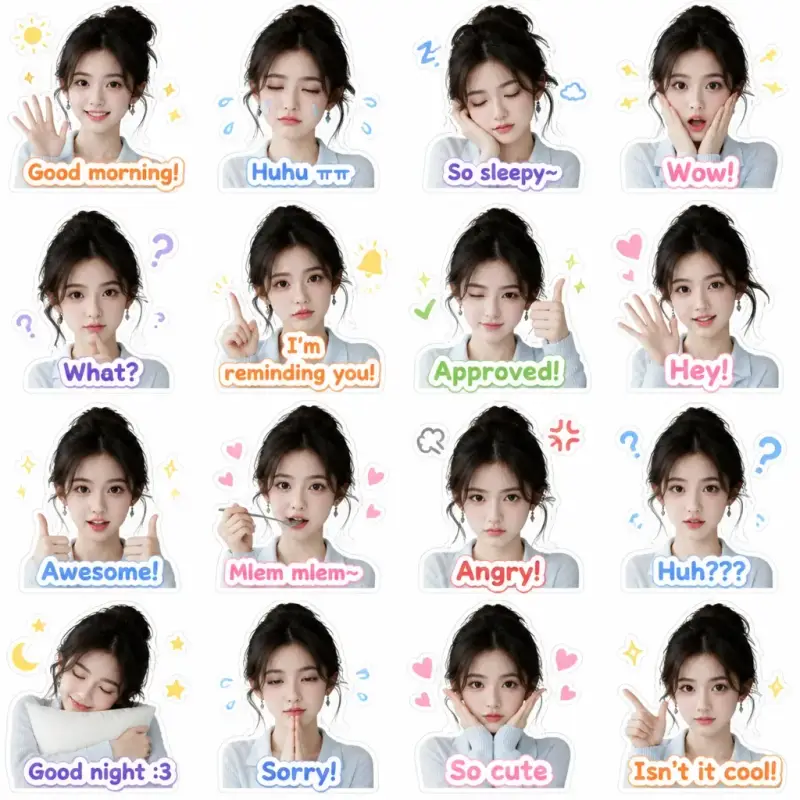
zalo style sticker
Create stylish Zalo sticker images using cute faces. Clean, simple background. A total of 16 diverse expressions: Smiling, crying, sleepy, surprised, bewildered, eating, frowning, adorable expression… Each expression has cute Enlgish text added: Examples: Good morning!, What?, I'm reminding you!, So sleepy~, Huhu ㅠㅠ, Wow!, Approved!, Hey!, Awesome!, Mlem mlem~, Angry!, Huh???, Good night :3, Sorry!, So cute, Isn't it cool!
0
0

Illustration
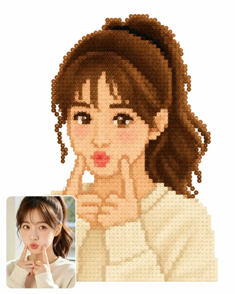
Photo to Perler Bead Style
Render the main subject of the image in a Perler bead style, with colors close to the effect in the image. Keep only the subject, simplify details, pure white background with no grid. Limit the number of Perler bead colors to 10 or fewer, with each bead being a single solid color.
0
0
Poster
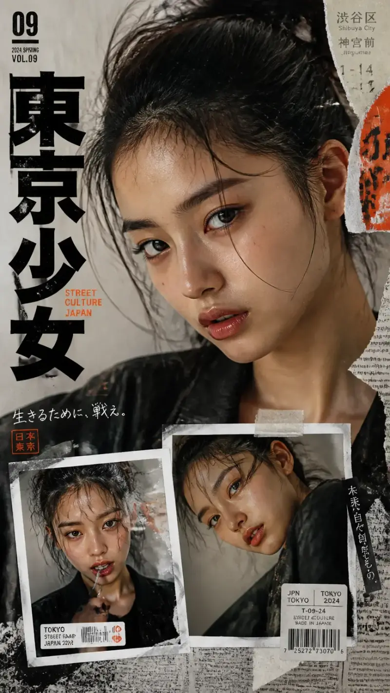
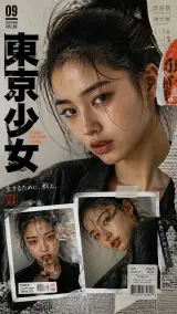
A bold Y2k Japanese Street-Editorial Collage Poster
Create a bold Y2K Japanese street-editorial collage poster with a clean high-fashion magazine aesthetic, gritty paper textures, torn magazine cutouts, distressed ink splashes, and urban Tokyo-inspired design. Main composition: one large cinematic close-up portrait at the top with intense eye focus, natural skin texture, glossy lips, messy tied-up hair, no glasses, soft dramatic lighting, confident innocent expression, ultra-realistic fashion photography style. Bottom composition: only 2 smaller portrait collage frames showing different facial expressions and angles, styled like ripped polaroids taped onto the poster. Design elements: oversized bold Japanese typography, minimal English text, subtle Japanese street signs, barcode stickers, newspaper scraps, vintage grunge textures, paint strokes, film grain, tape pieces, layered paper collage effects, and premium editorial magazine layout aesthetics. Style: edgy yet clean, modern Japanese fashion zine, cinematic shadows, sharp eye detail, RAW DSLR realism, editorial streetwear moodboard, premium graphic design, ultra detailed, 8K, balanced neutral tones, no pink aesthetic, no bubbles, no cartoon vibe.
0
0
Poster
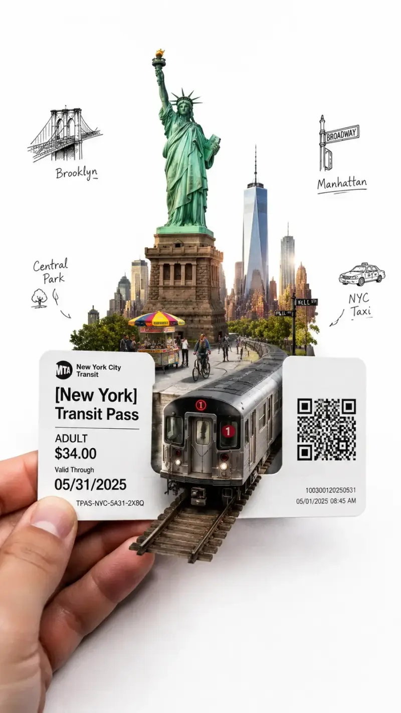
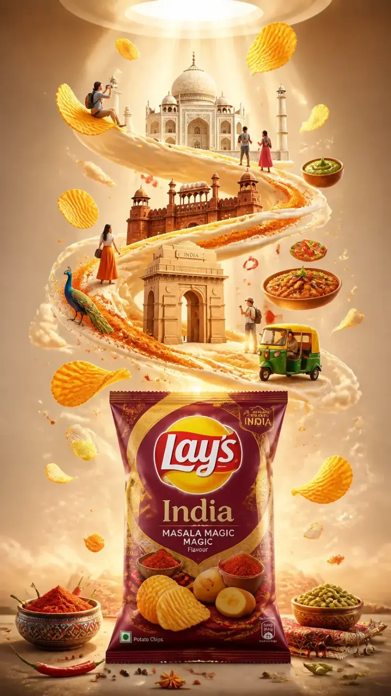
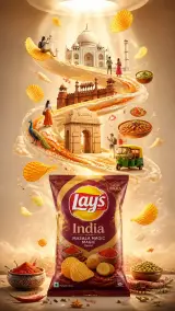
Ultra-Detailed Premium Travel-Food Advertisement Poster
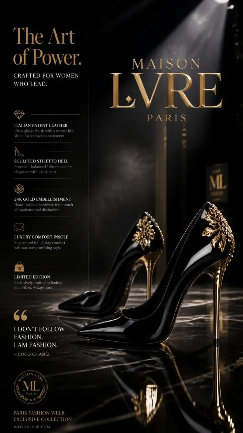
Ultra-detailed premium travel-food advertisement poster for [CITY/COUNTRY], vertical composition, inspired by luxury Lay’s-style chips advertising. A realistic chips packet placed at the bottom center as the main hero object, matching the exact premium commercial layout of a floating chips campaign. A cinematic spiral ribbon of sauce, cream, clouds, steam, or flavored swirl rises upward from the chips packet, dynamically wrapping around iconic landmarks, local foods, and cultural elements from [CITY/COUNTRY]. Floating ridged potato chips suspended naturally throughout the spiral motion, interacting with the landmarks and miniature travelers. The chips packet design must feel authentic to [CITY/COUNTRY], featuring regional colors, typography, patterns, and local flavor inspiration while still clearly looking like a premium potato chips package. Include only the most iconic landmarks from [CITY/COUNTRY], carefully spaced with clean composition and no clutter. Add miniature travelers naturally interacting with the environment: - taking photos - exploring landmarks - sitting on floating chips - riding local transport - observing scenery - walking through the swirl paths Include authentic local foods, ingredients, and atmosphere elements relevant to [CITY/COUNTRY]. Background should be soft pastel or warm luxury gradient with a circular ceiling portal opening at the top emitting cinematic spotlight beams. Elegant premium commercial lighting, soft shadows, floating particles, realistic depth, balanced negative space, luxury tourism campaign aesthetic, hyper-realistic CGI, highly detailed but minimalist, Instagram-worthy poster design. Composition rules: - one dominant centered chips packet - floating ridged potato chips throughout composition - one continuous upward spiral motion - landmarks layered vertically - miniature people sparse and intentional - no duplicate landmarks - no overcrowding - clean premium hierarchy - cinematic storytelling through scale contrast - premium advertising composition matching high-end chips commercials
0
0
Photography
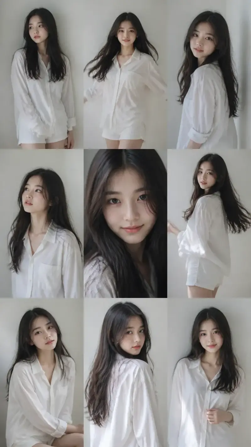
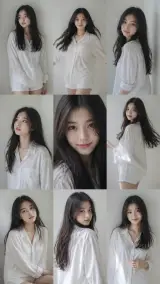
A 3x3 Grid Collage (Nine Images) Forming a Korean idol portrait photoshoot series
9:16 vertical — a 3x3 grid collage (nine images) forming a Korean idol portrait photoshoot series. Each frame features the same young Korean female idol, maintaining 100% consistency in facial features, proportions, hairstyle, and identity across all nine shots. Natural, ultra-realistic skin texture, no retouching, no smoothing. Clean idol-style minimal makeup, soft glow, subtle imperfections. Hair: long, voluminous dark hair, slightly tousled, consistent across all frames (natural loose flow, slight movement). Outfit: cohesive Korean idol photoshoot styling — white shirt + short bottoms (or simple neutral-toned outfit), youthful, clean, slightly casual but styled. Same outfit across all frames. Setting: minimal studio or simple indoor environment (plain wall, soft window light, clean background). Focus on subject, not environment. Lighting: soft diffused natural light, gentle highlights, low contrast, slightly airy tones, subtle film-like softness. Camera style: intimate portrait photography, slightly handheld feel, subtle imperfections (minor grain, slight blur in motion frames, imperfect framing). Frame breakdown (3x3 grid): Top row: - Top left: standing naturally, looking slightly away, relaxed expression - Top center: facing camera, casual mid-motion (hair or body slight movement) - Top right: slight side angle, soft gaze, natural candid feel Middle row: - Center left: looking slightly upward, soft thoughtful expression - Center: close-up portrait, direct eye contact, gentle idol smile - Center right: turning body slightly, mid-motion candid frame Bottom row: - Bottom left: seated or leaning casually, relaxed posture - Bottom center: back partially turned, looking over shoulder toward camera - Bottom right: standing close to frame, slightly playful or soft expression Mood: Korean idol photobook / photocard aesthetic, intimate, soft, natural, everyday charm. Quality: ultra-realistic, 8K detail, subtle analog film grain, natural imperfections, soft dreamy tone
0
0
Poster
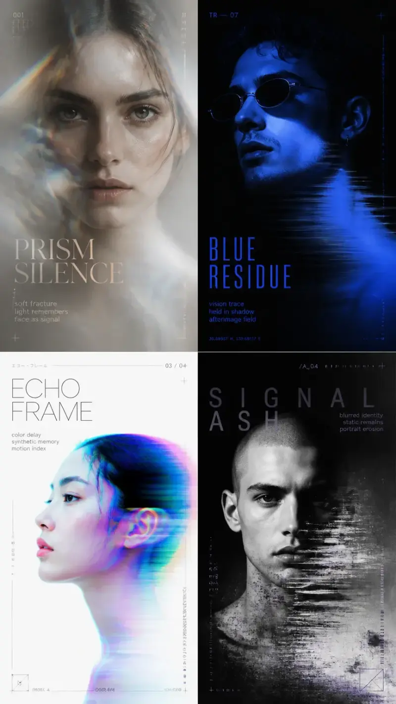
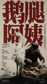
Poster of the Goose Leg Aunt Incident
You are not generating a regular illustration, nor a typography poster that simply enlarges a word and pastes it onto the image. Instead, you are creating a high-concept poster that "visually translates based on a deep understanding of the word's meaning." Your core task is: The user will provide a character, a word, a phrase, a short sentence, or a set of text. You must first deeply understand the surface meaning, deeper implication, emotional temperament, cultural associations, sense of fate of characters, atmosphere of the era, latent narrative, and implicit tension of the text, and then determine the most suitable visual language, composition, reading structure, color temperament, visual style, and visual metaphor. The goal of this poster is not to "draw the character" nor to "make an illustration with explanatory text," but to translate the mental state, texture of fate, emotional tension, and symbolic meaning behind the word or text into a high-level, minimalist, restrained, exhibition-grade, typographically strong, metaphor-rich, emotionally charged, highly memorable, and text-image integrated visual poster. I. Deep Semantic Understanding Mechanism Before generating the image, you must perform multi-layered analysis of the input text and decide all visual choices accordingly. 1. Understand the whole first First, judge the overall meaning, core theme, main emotion, potential contradictions, spiritual temperament, and the most powerful expressive direction of the user input. 2. If the input is a Chinese word, phrase, or short sentence, you must further deconstruct and understand Not only the overall meaning, but also the independent meanings of each character, key characters, and central characters, as well as their relationships. Especially identify: - The literal meaning of each character; - The cultural symbolism each character may carry; - The emotional weight each character brings; - Which characters are semantically core; - Which characters have greater visual potential; - Whether there is echo, progression, contrast, conflict, white space, or deeper spiritual connection between the overall meaning and the meanings of individual characters. 3. If it is a longer short sentence, find the true core word and core character Do not treat all text equally. Instead, find the most critical and visually dominant characters/words and build the visual order around them. 4. Must analyze the following dimensions - Surface meaning; - Deeper implication; - Emotional temperament; - Cultural associations; - Sense of fate of characters; - Social context; - Historical sense or sense of era; - Psychological tension; - Implicit conflict; - Symbolism and metaphor; - Visual translatability. 5. The style must be automatically generated from the meaning Do not mechanically apply a uniform template. Each word, each group of characters, each sentence should have a unique visual language that matches its own connotation. The style, composition, color, material, element density, reading rhythm, spatial relationship, text-image relationship must all grow out of the meaning, not be preset and unchangeable. II. General Principle: The entire poster must be a complete field This is the most core structural principle. 1. Do not make the image into a fragmented multi-column information board Do not split the main title, images, and explanatory text into three columns, four columns, or several independent modules. Do not create a segmented look like a magazine table of contents, exhibition board collage, or information panel. Do not make the reading experience like viewing a separated explanatory page. 2. The entire image must be a unified visual field Text, images, supplementary information, white space, spatial atmosphere, and reading path must all coexist within the same visual field. They pull at each other, interlock, and echo each other, not separate. 3. The reading experience must naturally integrate into the image The viewer's reading should be naturally guided by the composition, not forced by rigid column divisions. The reading path should feel like “wandering” and “flowing” through the image, rather than switching mechanically like reading a table. The image should have mood, breath, rhythm, and visual pauses and progression. 4. Text and image must coexist symbiotically Text is not pasted-on content, and the image is not an isolated illustration. They must together form a complete visual sentence and reading experience. III. Main Title System 1. The large Chinese main title “【input text】” must be the absolute subject. 2. The glyphs must be clear, complete, and recognizable—no typos, missing strokes, or ambiguity. 3. The main title should occupy most of the image area, forming the strongest first visual impression. 4. The main title is not only a title but also the skeleton, rhythm source, spatial structure, and meaning carrier of the image. 5. Key or central characters may receive stronger visual emphasis, but the overall text must be valid and readable. 6. The main title can serve as a background wall, structural surface, spatial barrier, stage backdrop, terrain, spiritual symbol, or emotional carrier. IV. Text-Image Integration Mechanism This is the key requirement of the current optimization. 1. Text must truly “grow” within the image Text should not simply be placed beside the image, nor float independently as a caption bar. It should appear as if generated from within the image, coexisting with the image, surface, and spatial atmosphere. 2. Text and image must be interdependent Image elements must relate to the text—for example: - standing in front of the text; - hiding inside the text; - passing through the glyphs; - clinging to the edges of the text; - using the negative space of the text to form an action; - treating the text as a scene, barrier, path, stage, or fate structure. In short, text and image must interlock. 3. Reading information should be naturally embedded in the image, not separated into information zones If a small amount of reading content is needed in the image, it should not be split into neat caption boxes, but naturally embedded: - it can be arranged along the edge of the title; - it can grow along a certain image element; - it can extend in the spatial direction; - it can gently rest in a local area like an exhibit label; - it can exist like a whispered supplementary note; - it can be like a breath, a lingering sound, a trace of warmth—not a rigid column annotation. 4. All reading content must serve the mood The existence of text is not just for information explanation, but to enhance the image’s temperament, context, association, emotion, and immersion. The reading experience itself is part of the image’s atmosphere. V. Reading Structure and Reading Path 1. The image must have a natural reading flow The viewer should first be drawn in by the main title, then hit by the image relationships, and then naturally see the supplementary reading information. The reading order should be smooth, rhythmic, with weight and lightness—not stacked together or rigidly juxtaposed. 2. Adopt “holistic reading” rather than “column reading” Do not make the image look like several sections pieced together. Information should be organized through size, distance, density, negative space, direction, and visual weight—not separated by columns and frame lines. 3. Reading rhythm must have layers First layer: the huge main title; Second layer: the core visual metaphor; Third layer: a small amount of reading information closely related to the image; Fourth layer: subtle but relevant supplementary content. These layers must be clear but not fragmented. 4. Information layout must have a sense of breathing Do not fill up, squeeze, or force alignment into newspaper-style columns. Let the information settle reasonably in the air, like modules, not spliced blocks. VI. Core Composition Mechanism The overall composition should prioritize the logic of “giant text skeleton + clean supporting surface + precise character/object interpretation + clever supplementary elements + flowing reading experience.” 1. The image should have a clear supporting surface. Try to include a structure resembling a stage, land, pedestal, horizon, platform, cross-section, field surface, base, or symbolic foothold. This supporting surface should allow characters and objects to truly “land,” enhancing order, drama, and stability. 2. The number of main subjects should be restrained. Typically 1 to 3 key subjects, which can be characters, objects, animals, symbols, or carriers that transition from abstract to concrete. Do not pile up characters; do not turn it into a group portrait illustration. 3. The main subjects must take on the task of “interpreting word meanings.” Subjects perform the meaning of the word through actions, positioning, orientation, distance, scale, relationships, contact, confrontation, offering, waiting, turning away, imbalance, falling, lifting, blocking, gazing, traversing, etc. VII. Visual Metaphor Refinement Mechanism Refine the most accurate, most representative core visual metaphor that can strike the viewer at a glance. 1. Prioritize finding a “single and strong” core metaphor. Do not turn the poster into a pile of multiple concepts; instead, find the most accurate and powerful symbolic scene or relationship. 2. The metaphor must be highly bound to the word’s meaning. Upon seeing the image, viewers should intuitively feel: this word is expressed in this way for a reason—it is accurate and clever. 3. Metaphors can be established through the following directions: - A sense of character fate; - Symbolic object relationships; - A moment of action; - Spatial oppression; - Scale contrast; - Juxtaposition of softness and hardness; - Contrast between innocence and danger; - Conflict between order and collapse; - Tension between closeness and distance; - Appearance and disappearance; - Binding and escape; - Giving and taking away; - Collision between reality and ideals; - Sense of time and history. VIII. Supplementary Element Mechanism A small number of appropriate supplementary elements can be incorporated into the image, but they must be clever, logical, and relevant, not cluttered filler. 1. The role of supplementary elements: - Deepen the theme; - Supplement layers of word meaning; - Establish visual echoes; - Enhance emotional atmosphere; - Strengthen cultural associations; - Reinforce image-text integration; - Make the whole more complete and engaging. 2. Supplementary elements must originate from semantic analysis. They cannot be randomly generated decorations. They should come from: - Symbols of the word; - Era temperament; - Cultural allusions; - Clues to character fate; - Environmental traces; - Mental states; - Action residues; - Spatial cues; - Material metaphors; - Narrative fragments. 3. Supplementary elements must relate to the main title, subjects, and reading content. They can echo: - A certain form of the type; - The subject’s action; - The spatial direction; - The small-scale reading content; - The color relationship. All elements must feel as if they grew out of the same system. 4. Supplementary elements must be restrained. They are there to enhance expression, not to be decorative noise. Better to have few but clever than many but chaotic. IX. Auxiliary Text Rules 1. Apart from the main title, there can be a very small amount of auxiliary text, but it is not mandatory. 2. Auxiliary text is only allowed when it can deepen the theme, supplement context, enhance concept, or enrich the reading experience. 3. Auxiliary text must be directly related to the theme. 4. Auxiliary text should appear in a way that “naturally embeds into the image,” not as an independent explanatory panel. 5. May be short phrases, fragments, annotations, contextual cues, poetic fillers, or miniature exhibition-caption content, but must be brief, precise, clever, and light. 6. No meaningless decorative small text, fake numbering, fake coordinates, fake signatures, fake descriptions, random English fragments, or irrelevant layout noise. 7. All auxiliary text must feel like part of the mood, not layout filler. X. Color Logic Colors must not look tacky; they must demonstrate top-level designer judgment. 1. Colors must be determined by word meaning, emotion, cultural temperament, and pictorial metaphor. 2. Do not mechanically apply fixed color palettes. 3. The number of colors should be strictly controlled, typically 2 to 4 main color relationships. 4. Color combinations should have a sophisticated, modern, restrained, exhibition-poster aesthetic quality. 5. Avoid cheap gradients, garish color clashes, meaningless high-saturation collisions, and template-like color schemes. 6. May use: - One strong dominant color; - One light or paper-like neutral color as spatial foundation; - One deep color as structural support; - One very small accent color for emotional punch or semantic emphasis. 7. The overall look must feel like an artistically judged poster, not ordinary commercial color work. XI. Style Requirements Overall character requirements: - Sophisticated; - Minimalist; - Restrained; - Exhibition-grade; - Strong typography; - Strong metaphor; - Strong emotion; - Strong memorability; - Strong image-text integration; - Strong mood; - Strong cohesion. Allow the following textural tendencies: - Graphic art poster; - Refined collage feel; - Lithographic print feel; - Screen print feel; - Printmaking feel; - Paper grain; - Slight printing noise; - Restrained material texture. But must avoid: - Messiness; - Cheap template feel; - Ordinary commercial illustration feel; - Cover caption feel; - Disconnected image and text; - Information divided into columns that break unity. XII. Execution Constraints 1. Do not mechanically apply templates. 2. Do not deviate from word meaning for the sake of aesthetics. 3. Do not cut reading content into three columns or multiple separate columns. 4. Do not create a patchwork page of "one block of image, one block of text, one block of description." 5. Do not merely create a character portrait illustration. 6. Do not merely create a typographic poster. 7. Do not let text and image be independent of each other. 8. Do not let supplementary information lack logical origin. 9. Do not make the image crowded, gaudy, low-grade, or over-decorated. XIII. Final Output Goal The final output is a high-concept poster centered on "[Input Text]". This poster must achieve: - Main title large, clear, and commanding; - Entire image feels like a unified visual field; - Reading experience naturally integrated into the image; - Image, text, reading, and mood merge rather than being split into columns; - Immediate visual impact at first glance; - Accurate translation of word meaning; - Precise and clever visual metaphor; - Supplementary elements appropriate and echoing each other; - Image, word, color, space, and symbolic elements form a unified system; - Overall with sophistication, design sense, exhibition quality, and communicability; - Let people instantly feel why this word is expressed this way. Create based on all the above rules. User Input: Input Text: [Goose Leg Auntie] Text Language: [Fill in here] Optional Supplementary Context: [The recent "Goose Leg Auntie" incident can be briefly summarized in three points: Core Incident: Chen Xiufeng, a popular street vendor who once gained fame on college campuses, was exposed for long-term use of duck legs passed off as goose legs (selling price: 16 yuan). When confronted, she admitted the truth, sparking strong consumer dissatisfaction and demands for rights protection. Response from the involved party: Chen Xiufeng argued that she had indeed sold goose legs in the early days, but later switched to duck legs due to supply shortages while keeping the sign "Goose Leg Auntie". She claimed it was just a nickname, not fraud. Regarding the greenish tint of the meat, she stated it was caused by marinating with fruit and vegetable juice. Optional emotional tendency: [Fill in here] Optional cultural direction: [Fill in here] Optional forbidden elements: [Fill in here] Allow auxiliary text: [Yes] If auxiliary text is allowed, state its relationship to the theme: [Fill in here]
2
0